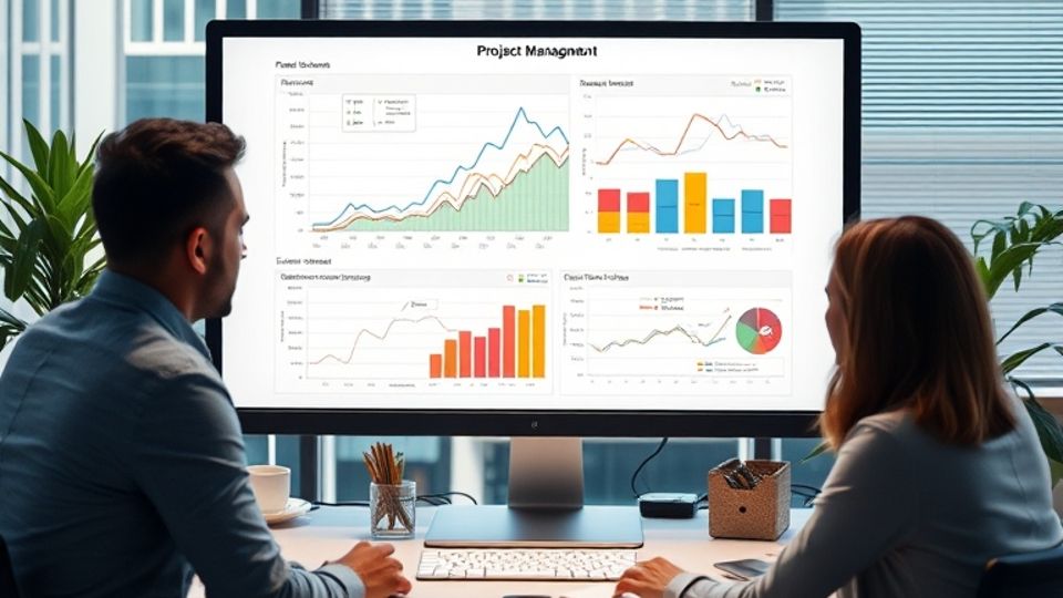
Project Management Graphs
Data visualization is one of the most crucial aspects of monitoring the progress of the project, identifying bottlenecks, and keeping the project on course within the project management domain. Project management graphs visually represent complicated information, detailing Gantt charts, burn-down charts, and resource-allocation graphs, and communicating among project stakeholders and team members. In this post, we'll take a deep dive into how to come up with useful project management graphs that empower you to streamline your project planning and execution.
Why Project Management Graphs Matter
Project management graphs do more than beautification; these are strong and effective tools that would enable the project manager to plot the time frame of completion, track resource consumption, or observe the realization of tasks. The graphs help bring meaning to data, which would not be readily observed from a list or a spreadsheet. The graphs identify potential risks, make informed decisions, and bring about overall efficiency to the project because they give a visual overview of the project.
Step 1: Determine the Type of Graph to Go With
Planning a project management graph involves deciding the particular type of graph. Here are some of the most common ones:
Gantt Charts: These are best for the scheduling and tracking of project timelines. A Gantt chart displays a task over a timeline, making it easy for a manager to quickly scan start dates, end dates, and task relationships.
Burn-Down Charts: These are employed in agile projects to track the quantum of work left against time. They are used to help teams see their progress and are used to find out if it is possible to meet deadlines.
Resource Allocation Graphs: These are graphs used in the analysis of monitoring resource usage by a project manager of personnel or equipment to ensure that no resource will be over- or underused.
Task Completion Graphs: Similar to progress charts, the graphs show the total number of tasks completed versus those that are still in the "to do" column. The total graphs are, therefore, a quick view of how much work has been done and what is remaining.
Step 2: Collect and Sort out Your Data
After you decide what kind of graph will satisfy your requirements, you will need to gather and arrange the data which is pertinent. This may include task start and end dates, resource assignments, project milestones, or maybe workload information for members of your project team. Of course, one should always remember that your graphs are only as good as the data representing them.
Step 3: Use the Right Tools
There are quite some tools in the market to make the process of creating the graph easy and swift when creating project management graphs. There are a ton of software applications, including Excel, MS Project, and Vabro, that have built-in features for creating different types of graphs. Of these, Vabro stands out as a fully AI-driven project management platform, which not only makes the graph creation easy but also provides advanced analytics to read the data. In Vabro, real-time graphs will be created illustrating how your project changes over time; they will update automatically to give you the most appropriate and latest information constantly.
Step 4: Customize Your Graphs
Customization is the key when it comes to project management charts. The more you customize the chart according to your needs, the more useful an output it gives. Remember that you can customize it to use different colors for urgent tasks or use labels to give more information about the data points. You might even want to consider putting an annotation to explain major milestones or changes in the project timeline. When you customize your graphs, you make sure they are precise in the information they convey.
Step 5: Review and Update Regularly
Project management is a dynamic process, just as the management of projects should be. Regularly check your graphs for updating, so that they shall correspond with the actual status of the project at that point. Update the graph when some tasks are completed, or deadlines are changed, or resources are reallocated. This continuous process is going to keep you ahead with a clear overview of the project and therefore help you in making better decisions and managing projects effectively.
Vabro: Simplifying the Creation and Analysis of Graphs
When it comes to creating project management graphs, there is no one better than Vabro. The platform is designed to be flexible and user-friendly so that project managers can easily generate and customize graphs for detailed analysis. Equipped with AI-driven analytics, Vabro gives you a much deeper view of your project data to help you identify trends, anticipate risks, and optimize resources. The facility to make real-time graphs whose data is updated automatically would mean that your team will always work with the truest information, hence making Vabro an invaluable tool for any project manager.
Conclusion
To briefly touch upon the importance of graphs in project management, this is one of the fundamental requirements of a project manager. After all, such visual tools bring clarity to the project and lead to better communication and better decision-making for the project owner during the lifecycle of a project. By following these steps, as shown in this guide: choosing the right type of graph, collecting the right data, using the right resources like Vabro, and keeping graphs updated easily and often, you can drive to the best visualizations and drive success with every project. With this approach, graphs in project management become something a bit more than just a reporting tool; they change and become a strategic asset that orients your team to achieve its objectives.