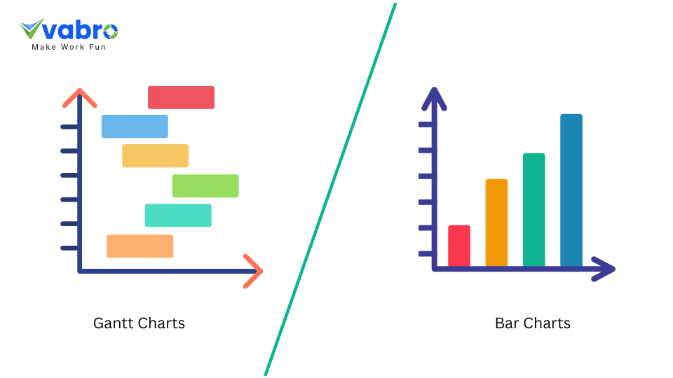
How do Gantt Charts Differ from Bar Charts?
Gantt charts and bar charts are both graphical tools that help visualize data, but they serve different purposes and offer distinct features. Understanding the differences between these two chart types can help you choose the right tool for your project management and data visualization needs.
1. Purpose and Function
Gantt charts are primarily used for project management. They show tasks, their durations, start and end dates, and dependencies, helping teams track progress against project timelines. A Gantt chart allows managers to visualize how different tasks overlap and how delays may impact the overall schedule.
Bar charts, on the other hand, are a general-purpose tool used to represent data in terms of categories, quantities, or frequencies. They use rectangular bars to show the size of data points, such as sales numbers, performance metrics, or any other measurable variables. Bar charts are commonly used in business reporting, analysis, and presentations.
2. Data Representation
A Gantt chart represents tasks along a horizontal timeline, with each bar representing a task’s duration. The length and position of each bar indicate when a task starts and ends, offering a clear view of how tasks align over time. Dependencies between tasks are often shown with arrows connecting the bars.
Bar charts, however, represent individual data points along an axis. Each bar’s height or length reflects the value of the category it represents, making it easy to compare quantities side by side. Bar charts are typically used for discrete data, like comparing sales figures across regions or time periods.
3. Complexity and Customization
Gantt charts are more detailed and customizable, especially in project management tools. They can show task dependencies, milestones, and changes in project timelines. Gantt charts also allow users to adjust timelines dynamically, providing real-time updates for better planning and coordination.
Bar charts are simpler and are often used to present a quick snapshot of data. While they can be customized to display different data points or categories, they do not offer the same level of detail or flexibility as Gantt charts in managing complex projects.
Why Choose Vabro for Project Management?
While both Gantt and bar charts have their uses, Vabro offers the best of both worlds for managing projects effectively. Vabro’s project management tool allows seamless integration of Gantt charts, providing detailed timelines, task management, and real-time updates to keep your projects on track. Whether you need to manage complex tasks or track team performance, Vabro’s intuitive interface makes it the ideal choice for streamlined project execution.
Try Vabro today and see how it can transform your project management experience!