Bar Chart vs. Gantt Chart
When it comes to visualizing project data, both bar charts and Gantt charts play vital roles in project management. Each chart type offers unique benefits and serves different purposes, making it crucial for project managers to understand their differences to choose the right one for their needs. In this article, we’ll explore the characteristics of bar charts and Gantt charts, and highlight how Vabro combines the best of both worlds to enhance project management efficiency.
1. Understanding Bar Charts
Bar charts are graphical representations of data using rectangular bars. They display quantities of different categories, making it easy to compare values at a glance. Bar charts are particularly useful for showing discrete data, such as the number of tasks completed by team members or the resources allocated to various project phases.
Advantages of Bar Charts:
- Simplicity: Bar charts are easy to read and interpret, making them ideal for presenting data to stakeholders who may not be familiar with intricate project details.
- Versatility: They can be used to illustrate various aspects of project performance, such as costs, timeframes, or team workloads.
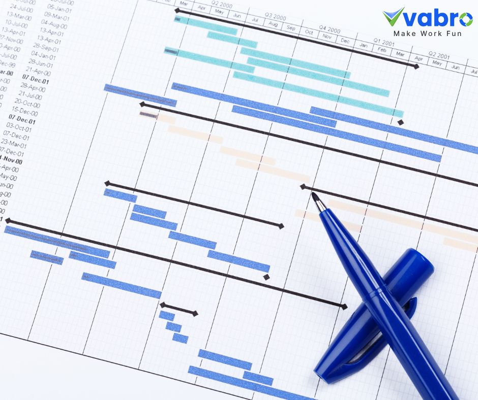
2. Understanding Gantt Charts
Gantt charts, on the other hand, are specialized project management tools that visually represent a project’s timeline. They display tasks along a timeline, illustrating start and end dates, task durations, and dependencies between tasks. Gantt charts are instrumental in tracking project progress and ensuring that all tasks align with the overall project schedule.
Advantages of Gantt Charts:
- Comprehensive Overview: Gantt charts provide a clear view of the entire project timeline, allowing managers to identify critical paths and potential delays.
- Task Dependencies: They effectively show how tasks are interconnected, enabling project managers to make informed decisions about resource allocation and scheduling.
3. When to Use Each Chart
- Bar Charts: Best for presenting data comparisons and performance metrics. If your goal is to analyze resource distribution or track team performance, bar charts are a practical choice.
- Gantt Charts: Ideal for project planning and monitoring progress. When you need to visualize the timeline and dependencies of tasks, Gantt charts are more effective.
4. Vabro: The Best of Both Worlds
Vabro integrates the features of both bar charts and Gantt charts into a single platform. With its dynamic dashboards, Vabro allows project managers to view performance metrics through bar charts while also providing detailed Gantt charts for timeline management. This all-in-one solution simplifies project oversight, enabling teams to monitor progress, manage resources, and adapt to changes swiftly.
Conclusion
While bar charts and Gantt charts serve distinct purposes in project management, choosing the right tool depends on your specific needs. Bar charts excel in presenting comparative data, while Gantt charts offer comprehensive timeline views. Vabro enhances project management by combining these functionalities into one cohesive platform, ensuring teams can visualize both performance metrics and project timelines effectively. For organizations aiming to improve their project management processes, Vabro is the superior choice that delivers efficiency and clarity.